How to Fix WordPress Mobile Layout Issues: A Complete Guide 2026
Published: 2 Mar 2026
Struggling to make your WordPress site look right on mobile? You’re not alone; many beginners face layout issues that make pages hard to read, buttons tricky to tap, and content appear broken on phones.
Don’t worry. This guide on how to fix WordPress mobile layout issues will walk you through everything step by step. By the end, you’ll know exactly what to do to make your site look smooth and professional on any mobile device.
Mobile traffic now dominates the web. If your site looks broken on a phone, you risk losing visitors, trust, and sales. Many beginners build their site on a laptop and assume it works everywhere, then they open it on a phone and see overlapping text, tiny buttons, or menus that won’t open.
This guide takes you through identifying, fixing, and preventing mobile layout issues in WordPress. You’ll learn what causes these problems, how to diagnose them properly, and how to fix them, even if you’re a complete beginner.
Understanding Mobile Usability & Layout Issues in WordPress
Mobile visitors now make up the majority of web traffic, yet many WordPress sites still struggle on small screens. If your site’s text gets cut off, buttons overlap, or menus don’t work, it frustrates users and drives them away.
Understanding mobile usability and layout issues is the first step to fixing these problems. By learning how layout problems and usability errors differ, and how they affect both user experience and SEO, you’ll be better equipped to make your site smooth and readable
What Are Mobile Layout Issues?
Mobile layout issues happen when your website does not adjust properly to smaller screens. Instead of resizing and reorganizing content, the page may:
- Cut off text
- Stack elements incorrectly
- Overlap images and buttons
- Push content outside the screen
- Break menus
A responsive website adapts automatically. A non-responsive one forces users to zoom and scroll sideways.
Mobile Layout Problems vs Mobile Usability Errors
These terms sound similar but differ slightly:
- Layout problems: Design and structural issues (e.g., content wider than the screen).
- Usability errors: Interaction issues (e.g., buttons too close together).
Both matter. Search engines evaluate usability signals when ranking pages.
How These Issues Affect User Experience
Suppose someone visits your site to book a service. The contact form loads, but the submit button sits off-screen. They try to zoom. It still doesn’t work. They leave.
That single frustration increases your bounce rate and reduces conversions.
How Mobile Layout Problems Impact SEO Rankings
Search engines prioritize mobile-first indexing. That means they primarily evaluate the mobile version of your site.
If your mobile version loads slowly, shifts during loading, or contains usability errors, rankings can drop.
Why Mobile Usability Matters in 2026
Users expect speed and clarity. They don’t tolerate broken layouts. Good mobile design:
- Reduces bounce rate
- Improves dwell time
- Increases trust
- Boosts conversions
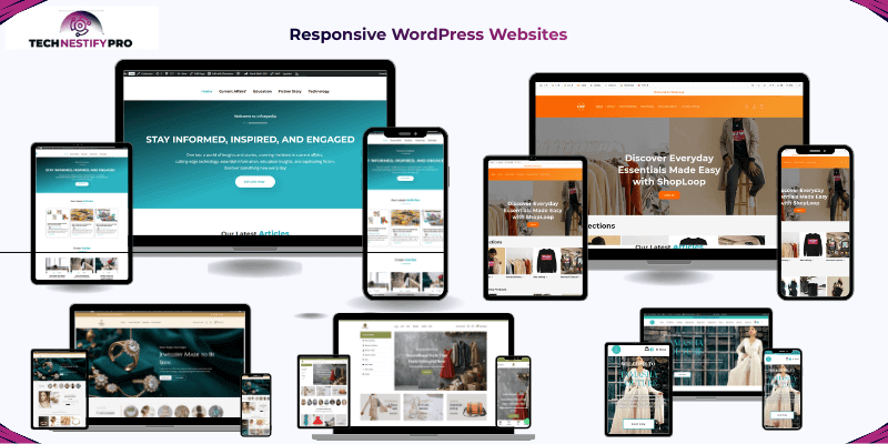
Why Responsive WordPress Website Design is Important?
A responsive WordPress website makes sure your site looks and works great on every device, from smartphones to large desktop screens. Without it, visitors may struggle to read text, tap buttons, or navigate menus, which can hurt engagement and conversions.
Responsive design isn’t just about resizing, it’s about keeping your content clear, your brand consistent, and your site fast. Mobile-first thinking, consistent styling, and speed optimization together create a smooth experience that keeps visitors coming back.
Ensure Your Website Is Accessible on All Devices
Responsive design ensures your website works on:
- Smartphones
- Tablets
- Laptops
- Large desktop screens
Your content should resize automatically without breaking structure.
Mobile-First Design Approach
Designing mobile-first means you build for small screens first, then expand to larger screens. This forces you to:
- Prioritize clarity
- Remove clutter
- Focus on core content
Consistent Design Across All Devices
Your brand should look consistent everywhere. Fonts, spacing, colours, and structure should adjust smoothly, not randomly.
Optimize for a Fast Experience
Mobile users often browse on slower connections. Reduce page weight and eliminate unnecessary scripts to maintain website speed.
Tip: The ideal load time on mobile should be less than 2.5 seconds.
Why Responsive Design Matters for SEO
Search engines prioritize mobile-friendly sites. A responsive site:
- Improves search rankings
- Boosts user engagement
- Reduces bounce rate
- Increases trust and conversions
Pro Tip: Run the Google Mobile-Friendly Test to check your site and get instant recommendations.
Overview of Common Mobile View Issues
Beginners often run into the same mobile layout problems on WordPress. Knowing them helps you identify and fix them faster. Here are the most frequent issues:
- Text too small to read – Visitors struggle to read content without zooming, hurting engagement.
- Buttons too close together – Users may tap the wrong button, causing frustration.
- Content wider than the screen – Pages require horizontal scrolling, which is inconvenient.
- Overlapping sections – Text, images, or buttons cover each other, making content unreadable.
- Images overflowing containers – Pictures break the layout or appear cut off.
- Broken hamburger menus – Mobile menus may not open or hide key links.
- Pop-ups blocking the screen – Intrusive banners prevent users from accessing content.
- Forms that require horizontal scrolling – Filling out forms becomes difficult or impossible.
- Layout shifts while loading – Elements move unexpectedly, confusing visitors.
Each of these problems impacts user experience and search engine rankings, but the good news is that all of them can be fixed. In the upcoming sections, I’ll show step-by-step solutions tailored for beginners.
How Can You Check Mobile Layout Issues on Your WordPress Website?
Before fixing any mobile layout problem, you must first identify where the issue exists. Many beginners jump straight to changing themes or installing plugins without properly testing their site. This often wastes time and sometimes creates new problems.
A proper check helps you see your website the same way visitors see it on their phones. By testing your site using real devices and trusted diagnostic tools, you can quickly detect layout problems, usability issues, and performance bottlenecks.
Below are practical methods beginners can use to assess mobile layout issues on a WordPress website.
1. Check Your Website on a Real Smartphone
This is the simplest and most reliable test. Many website owners build their site on a desktop or laptop and assume it works perfectly on mobile devices. However, smaller screens behave differently.
Open your website on an actual phone and browse it like a normal visitor.
Check the following:
- Scroll through the entire page slowly
- Tap every button and link
- Open navigation menus
- Fill out forms if available
- Watch how images and videos load
- Rotate your phone between portrait and landscape mode
Look for warning signs such as:
- Text that is hard to read
- Buttons that are difficult to tap
- Content that goes outside the screen
- Sections overlapping each other
If something feels uncomfortable or confusing to use, visitors will likely feel the same.
Tip: Spend at least five minutes navigating your own site like a first-time visitor.
2. Use Google Search Console
Google Search Console helps you identify mobile usability issues detected by Google’s crawler. These reports show problems that may affect how your pages rank in search results.
After connecting your website to Search Console, check the Page Experience and mobile usability reports.
Common issues reported include:
- Clickable elements are placed too close together
- Content wider than the screen
- Text too small to read
- Elements that shift during page loading
Each warning links to the specific page where the problem appears. This makes it easier to locate and fix layout issues quickly.
Tip: Review Search Console reports regularly so you can fix mobile issues before they impact search visibility.
3. Use Lighthouse for Technical Analysis
Lighthouse is a built-in auditing tool available inside the Chrome browser. It analyzes your website and provides a detailed report about performance, accessibility, and layout stability.
When you run a Lighthouse audit, it evaluates important factors such as:
- Layout shifts during loading (Cumulative Layout Shift)
- Mobile page speed
- Accessibility problems
- Structural issues affecting responsiveness
The report highlights specific elements causing instability, such as oversized images or delayed scripts.
This helps you understand which parts of the page are responsible for layout problems.
Tip: Run Lighthouse tests on multiple pages, not just the homepage.
4. Use PageSpeed Insights
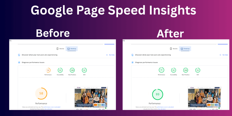
PageSpeed Insights evaluates your website’s mobile performance and provides clear recommendations for improvement.
After entering your website URL, the tool shows:
- A mobile performance score
- Key performance metrics
- Suggestions to improve loading speed and layout stability
It also highlights elements that may cause layout shifts, such as large images without defined dimensions or scripts that delay page rendering.
While speed matters, beginners should focus first on layout stability and usability, then improve performance gradually.
Tip: Don’t chase a perfect score. A stable, easy-to-use mobile layout matters more than hitting 100/100.
Common Causes of Mobile Layout Issues on WordPress Websites
When your site looks great on a laptop but breaks on a phone, something in the setup usually causes it. Most mobile layout problems come from themes, plugins, design choices, or skipped testing. Mobile responsive issues usually happen because something was built or installed without thinking about smartphones.
Below, I’ll walk you through the most common causes of the problem. You’ll understand what creates the issue and what you can do to prevent it.
Unoptimized WordPress Theme
Your theme controls your website’s design and layout. If you use an outdated or poorly built theme, it may not adjust properly to smaller screens.
Some themes look beautiful in demo previews but break when you add your own content. Text may overflow, images may stretch, and sections may stack in strange ways.
Many older themes were built before mobile traffic became dominant. They stretch content, shrink text too much, or push elements off-screen.
What you can do:
- Choose a modern, mobile-responsive theme.
- Check the theme’s demo on your phone before installing it.
- Update your theme regularly.
- Avoid nulled or poorly reviewed themes.
A well-coded theme is your foundation. If the foundation is weak, every page will struggle on mobile.
Theme & Page Builder–Specific Issues
Page builders make design easier, but they can create problems if you only design for the desktop view. Many builders allow separate settings for mobile. If you ignore those settings, your layout may not adjust properly.
Page builders like Elementor or Divi give you drag-and-drop control. But they also add layers of layout settings for desktop, tablet, and mobile.
If you only design for desktop, the mobile version may stack incorrectly or hide important content.
Common mistakes:
- Forgetting to adjust mobile spacing
- Setting large padding or margins for desktop only
- Hiding elements unintentionally on mobile view
- Columns are staying side by side instead of stacking
- Large images are pushing text down too far
Always switch to the mobile preview inside your page builder and adjust spacing, font size, and alignment specifically for smaller screens.
Plugin Conflicts
Plugins add features, but they also add code. Sometimes two plugins try to control the same design elements, which creates layout problems.
For example:
- A pop-up plugin may push content down.
- A slider plugin may stretch beyond the screen width.
- A styling plugin may override theme settings.
What you can do:
- Deactivate plugins one at a time to identify the problem.
- Remove plugins you no longer use.
- It is best to avoid installing multiple plugins that perform the same function.
Keep your setup lean. Fewer plugins often mean fewer conflicts.
Misconfigured Content Management Plugins
Some plugins control galleries, sliders, forms, or product displays. If you don’t configure them for mobile, they may try to display too many items on small screens.
For example:
- A product grid showing four items per row on desktop may squeeze four items onto mobile.
- A slider may not resize images correctly.
Always check plugin settings for mobile display options.
Caching, optimization, and security plugins can change how your site loads. If you configure them incorrectly, they may delay styles or load scripts in the wrong order.
That can cause:
- Flashing content
- Layout shifting
- Broken menus
If you use tools like LiteSpeed Cache or WP Rocket, review their mobile-specific settings carefully.
Test your site after every major setting change.
Heavy Use of Custom Code Without Mobile Considerations
Custom CSS and HTML give you control. But if you write code only for large screens, mobile devices may struggle.
For example:
- You set fixed widths in pixels.
- You position elements with absolute positioning.
- You add large spacing that doesn’t shrink on smaller screens.
If you add custom code, always test it on mobile. Even simple styling can break layouts if you don’t adjust it for smaller devices.
Improper Use of JavaScript and CSS
CSS controls layout. JavaScript controls behaviour. If either loads incorrectly or blocks important styles, your layout may look broken while the page loads.
Common problems:
- Scripts that move content after loading
- Stylesheets that load too late
- Animations that push elements around
Keep scripts lightweight. Load only what you need. You don’t need to understand coding deeply. Just know that too many scripts or poorly added styling can cause problems.
Inconsistent Use of Breakpoints in CSS
Breakpoints tell your website when to adjust its layout for different screen sizes.
If you use inconsistent breakpoints, your layout may look fine on one phone but broken on another.
For example:
- You design for 768px but ignore smaller devices.
- You stack columns too late.
- You hide content unintentionally.
Stick to standard mobile breakpoints and test at multiple screen widths. If you use a page builder, check that mobile settings apply to all screen sizes, not just one.
Fixed-Width Layouts Instead of Flexible Layouts
If your layout uses fixed pixel widths (like 1200px), it cannot shrink properly on smaller screens.
That creates horizontal scrolling and cut-off content. Fixed width means your content stays at one size no matter the screen. Flexible layouts adjust automatically. If users have to scroll sideways to see your content, your layout is likely fixed instead of flexible.
Flexible layouts use percentages instead of fixed numbers. They adapt automatically to screen size.
Tip: Avoid fixed widths unless necessary.
Unoptimized Images and Media
Large images can break mobile layouts in two ways:
- They load slowly.
- They stretch outside their container.
Uploading full-size camera images without resizing them causes major mobile issues. If you don’t set image dimensions properly, your page may shift while loading. That creates a poor user experience.
Best practices:
- Compress images before uploading.
- Use correct image sizes.
- Avoid uploading 4000px images for small content areas.
- Set width and height attributes when possible.
Fast, properly sized images protect both design and performance.
Embedded Content (Videos, Iframes) Not Responsive
YouTube videos, maps, or booking widgets often use iframes. If you don’t make them responsive, they can:
- Extend beyond the screen
- Push other content out of place
- Create horizontal scrolling
When embedding from platforms like YouTube, ensure the container scales properly. Wrap embedded content in a responsive container so it adjusts to screen size.
Non-Responsive Fonts and Typography
Text that looks perfect on a desktop may appear tiny on a phone. If your font size does not adjust for smaller screens, users may need to zoom in to read. That creates frustration and increases bounce rate.
Common issues:
- Font size below 14px
- Headings too large for small screens
- Line spacing is too tight
Use readable font sizes for mobile users. Most readers browse on smartphones, and they expect clear, comfortable text.
Incorrect Viewport Meta Tag Settings
The viewport tag instructs browsers on how to scale or resize your page. If it’s missing or incorrect, your site may appear zoomed out or too small.
Make sure your site includes this in the header:
<meta name=”viewport” content=”width=device-width, initial-scale=1.0″>
Most modern themes include it automatically, but always double-check. If you use an old theme, it may be missing.
Not Using Mobile-Friendly Forms and Input Fields
Forms that work on desktops often frustrate mobile users.
Common mistakes:
- Small input boxes
- Tiny checkboxes
- Difficult dropdowns
If users struggle to fill out your contact form, they will leave.
Make forms simple:
- One-column layout
- Large buttons
- Easy-to-read labels
Use larger fields and space them properly. Make it easy for users to tap and type without zooming.
Poorly Configured Menus and Navigation
Navigation must feel natural and simple on mobile. If your menu:
- Has too many items
- Uses tiny links
- Doesn’t open smoothly
Users will get confused. Common issues:
- Menus that don’t open properly
- Dropdowns that require hover (which doesn’t exist on touch screens)
- Too many menu items
Use a clean hamburger menu design. Keep navigation simple and easy to tap.
Overuse of Pop-Ups and Interstitials
Pop-ups may look fine on a desktop, but can block the entire screen on a phone. It can hurt mobile usability more than help it. Large pop-ups may:
- Cover the entire screen
- It will be difficult to close
- Shift the layout
Google also discourages full-screen pop-ups that block content on mobile. Limit large pop-ups and make sure visitors can close them easily without hunting for a tiny “X” button. Use pop-ups carefully and always test them on smaller screens to make sure they don’t cover important information or frustrate users.
Inadequate Mobile Caching and Performance Optimization
Mobile users expect speed. Users quickly leave your site if it loads slowly. Slow loading can cause layout shifts. When elements load at different times, the page may jump or move. This creates a poor user experience.
If your site loads slowly on mobile:
- Optimize images
- Use caching tools
- Choose reliable hosting
- Minify CSS and JavaScript when possible.
Faster sites maintain stable layouts. Test performance using tools like Google PageSpeed Insights to see mobile-specific scores.
Failure to Optimize for Different Mobile Browsers
Not all visitors use the same browser. Some use Chrome, others use Safari or Firefox. A layout may work in one browser and break in another. Not all mobile browsers behave the same.
Your site may look fine in Chrome, but slightly different in Safari.
Always test your site on:
- iPhone (Safari)
- Android (Chrome)
- At least one other browser
This helps you catch hidden issues. Test across major browsers to ensure consistency.
Ignoring Touchscreen Navigation Needs
People on phones do not use a mouse. They tap with their fingers. That simple difference changes how your website should work.
If you design your site for tiny mouse clicks, mobile visitors will struggle. Fingers are much larger than a cursor. When buttons, links, or menu items sit too close together, users tap the wrong thing by mistake. That leads to frustration and quick exits.
Why This Matters for Your Website
Suppose you are ordering food on your phone. If the “Add to Cart” button sits right next to “Remove,” you might hit the wrong one. That small mistake feels annoying. The same thing happens on your website.
If visitors feel annoyed, they leave. When they leave quickly, search engines notice. That can hurt your rankings over time.
Lack of Adequate Support for Mobile Gestures
Mobile users interact with websites using natural finger movements. They expect your site to respond smoothly when they:
- Scroll up and down
- Swipe left or right
- Tap buttons and links
- Pinch to zoom in or out
Problems happen when your website does not respond to these actions properly. For example:
- Image sliders do not move when users swipe
- Galleries only work with tiny arrow buttons
- Maps do not zoom with a pinch
- Sections lag or feel jumpy while scrolling
When gestures do not work the way people expect, your site feels broken or outdated, even if everything looks fine on desktop.
Lack of Testing Across Multiple Devices
A common oversight is assuming a website works the same on all gadgets. Many beginners only check their site on a computer and miss how it behaves on other screens.
To ensure a smooth experience, review your site on:
- Various phone screen dimensions
- iOS and Android smartphones
- Tablets, if your audience uses them
- Different browsers like Safari, Chrome, or Edge
For instance, a menu may appear aligned on a desktop but overlap content on a compact phone display. Checking across devices helps you:
- Spot layout glitches early
- Avoid frustrating your visitors
- Maintain engagement and conversions
- Keep your site looking professional
Even brief testing on friends’ or colleagues’ devices can reveal problems that aren’t visible on your own screen.
When you understand these causes, you gain control over your mobile experience. Most layout problems don’t require advanced technical skills. They require awareness, proper testing, and thoughtful setup.
Fix the root cause, and your site becomes easier to use, faster to load, and more trustworthy in the eyes of both visitors and search engines.
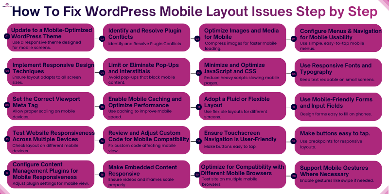
How To Fix WordPress Mobile Layout Issues Step by Step?
Currently, mobile devices account for more than 60% of website traffic. If your WordPress site does not work properly on phones, you risk losing visitors, leads, and sales.
To fix WordPress mobile layout issues step by step, update to a responsive theme, remove conflicting plugins, optimize images and media, use flexible layouts, adjust fonts and buttons for touch screens, set the correct viewport tag, reduce heavy scripts, and test your site on multiple devices and browsers. These actions help your website display correctly, load faster, and function smoothly on smartphones and tablets.
Below, you’ll find clear, beginner-friendly solutions for each common mobile layout problem. Follow these steps carefully, and you won’t need to search for extra fixes elsewhere.
1. Update to a Mobile-Optimized WordPress Theme
Your WordPress theme controls your site’s layout, spacing, fonts, and overall structure. If the theme is outdated or poorly coded, your website may look fine on a desktop but break on smaller screens. You may see overlapping text, stretched images, or sections that don’t fit the screen.
A modern responsive theme automatically adjusts the layout to different screen sizes, such as smartphones and tablets.
What to do
- Check if your current theme is mobile-friendly.
Open your website on a smartphone and scroll through several pages. Look for text that is too small, images that overflow the screen, or menus that are difficult to tap. - Run a quick mobile test.
Use the Google Mobile-Friendly Test to see if your site passes mobile usability checks. - Choose a lightweight responsive theme.
Select themes that clearly state they support mobile devices and responsive layouts. - Check the theme’s update history.
A theme that receives regular updates is more likely to stay compatible with new WordPress versions. - Preview the demo on your phone.
Most themes provide a live demo. Open the demo on your phone to see how menus, images, and buttons behave. - Avoid themes overloaded with built-in effects.
Themes with too many animations, sliders, or visual effects often slow down mobile pages. - Switch to a reliable theme if needed.
Well-known themes such as Astra, GeneratePress, and Neve are designed to work smoothly on mobile devices. 
- Test your website after activating the theme.
Check several pages, including your homepage, blog posts, product pages, and contact forms.
Pro Tip
It is recommended to back up your website first using a backup plugin or your host’s backup tool, which will allow you to quickly restore your site if anything goes wrong.
2. Identify and Resolve Plugin Conflicts
Plugins add useful features to a WordPress website, such as contact forms, sliders, pop-ups, and security tools. However, when multiple plugins try to control the same part of your site, they can interfere with each other. This often leads to broken mobile layouts, misaligned sections, or buttons that stop working on smaller screens.
Many mobile layout problems happen because two plugins load conflicting styles or scripts.
What to do
- Temporarily deactivate all plugins.
Go to your WordPress dashboard → Plugins → Installed Plugins → select all → click Deactivate. Then check your site on a phone. - Check if the layout problem disappears.
If your site looks normal on mobile after disabling plugins, a plugin conflict is likely the cause. - Reactivate plugins one by one.
Turn on one plugin at a time and refresh your mobile view after each activation. - Watch for the plugin that breaks the layout.
When the problem appears again, the last plugin you activated is likely causing the issue. - Replace or remove the conflicting plugin.
Look for an alternative plugin that performs the same function but works better with your theme. - Update all plugins regularly.
Developers often release updates to fix compatibility problems and mobile display issues. - Check common problem plugins.
These types of plugins often cause layout conflicts:
- Page builder add-ons
- Slider or carousel plugins
- Popup and marketing plugins
- Caching and optimization plugins
- Old plugins that are no longer maintained
- Page builder add-ons
- Use troubleshooting tools if needed.
Plugins like Health Check & Troubleshooting allow you to test plugin problems without harming visitors.
Pro Tip
Before installing a plugin, check when it was last updated and read recent reviews. Plugins that receive regular updates and have strong ratings are less likely to cause compatibility problems.
3. Optimize Images and Media for Mobile
Images play a big role in how your website looks, but large files can slow down your pages and break layouts on smaller screens. When images are too large, they may stretch beyond the screen or take too long to load. This creates a poor experience for mobile visitors.
When ranking websites, search engines also consider page speed. A slow mobile page can reduce visibility in search results and increase bounce rates.
What to do
- Resize images before uploading.
For most websites, an image width of 1200px or less works well. This size keeps images clear while preventing oversized files. - Compress images to reduce file size.
Use tools such as TinyPNG or WordPress optimization plugins to shrink image size without reducing visual quality. - Use modern image formats.
Formats like WebP create smaller files than traditional JPEG or PNG images while maintaining quality. - Enable lazy loading.
Lazy loading allows images to load only when a user scrolls to them. WordPress already supports this feature by default in newer versions. - Avoid uploading images directly from cameras or phones.
Photos taken with modern smartphones often exceed 3000–4000px in width, which is far larger than needed for a website. - Check how images appear on smaller screens.
After uploading, preview your pages on a smartphone to ensure images scale properly and do not push other elements out of place.
Pro Tip
Try to keep most website images under 100 KB. Smaller image files load faster, improve mobile performance, and help your pages pass speed tests like Google PageSpeed Insights.
4. Configure Menus and Navigation for Mobile Usability
Navigation helps visitors move around your website. If your menu is confusing or hard to tap on a phone, people leave quickly. On small screens, space is limited. A menu that looks clean on a laptop can feel crowded on a smartphone.
Clear and simple navigation improves user experience and also helps search engines understand your website structure.
What to do
- Use a hamburger-style menu for mobile.
Most modern themes automatically switch to a three-line (☰) menu icon on smaller screens. If yours does not, check your theme’s mobile settings. - Limit menu items to essential pages.
Keep only important links like Home, About, Services, Blog, and Contact. Too many links make the menu hard to scan. - Avoid deep dropdown levels.
Multi-level dropdown menus are difficult to use on touch screens. Try to keep navigation to one or two levels only. - Make menu buttons easy to tap.
Links should have enough space between them. Small or tightly packed items lead to accidental taps. - Use sticky navigation carefully.
A fixed menu that stays at the top can help users navigate easily. However, make sure it does not cover too much screen space. - Check alignment and spacing.
Make sure menu text does not overlap or run off the screen. - Set the correct mobile menu location.
Go to Appearance → Menus in WordPress and confirm your primary menu is assigned properly.
Common beginner mistake
Many site owners copy desktop menu layouts directly to mobile without simplifying them. Mobile users want quick access, not too many options.
Pro Tip
Hold your phone in one hand and try to navigate your website using your thumb only. If it feels difficult or crowded, adjust spacing and reduce items until it feels smooth and natural.
5. Implement Responsive Design Techniques
With responsive design, your website layout adjusts automatically according to different screen sizes. This means your content, images, and sections rearrange themselves so they remain readable and usable on phones, tablets, and desktops.
If a layout is not responsive, elements may overflow the screen, overlap each other, or appear too small on mobile devices.
What to do
- Use percentage-based widths instead of fixed pixel widths.
Flexible widths allow elements to scale according to screen size rather than staying locked to one fixed size. - Avoid rigid positioning unless it is absolutely necessary.
Fixed elements can break layouts on smaller screens and may overlap other content. - Use responsive blocks in the WordPress editor.
Most modern blocks automatically adjust spacing, width, and alignment for smaller screens. - Check column layouts carefully.
Multi-column sections should stack vertically on smaller screens so the text remains readable. - Adjust spacing and padding for smaller screens.
Large margins or wide spacing may push important content too far down on a phone. - Use flexible containers for images and videos.
Media should automatically resize to fit within the screen width. - Preview your website before publishing.
Always check how the layout behaves on smaller displays.
Pro Tip
Use the WordPress Customizer device preview or your browser’s mobile view to quickly check how sections rearrange themselves. Fix layout issues before visitors see them.
6. Limit or Eliminate Pop-Ups and Full-Screen Overlays
Large pop-ups that block content can frustrate mobile visitors. When users open a page and cannot see the content right away, many leave the site. Search engines also discourage disruptive mobile pop-ups because they harm user experience.
What to do:
- Avoid full-screen pop-ups that appear immediately after the page loads.
- Use smaller banners, slide-ins, or inline forms instead of blocking overlays.
- Make the close (X) button large and easy to tap on small screens.
- Delay pop-ups by a few seconds so visitors can read the content first.
- Show pop-ups only on important pages such as product pages or blog posts where sign-ups make sense.
- Test the pop-up on different screen sizes to make sure it does not cover important content.
Pro Tip:
If your bounce rate increases or conversions drop after adding a pop-up, remove it or replace it with a smaller banner. Mobile users prefer pages where they can read content without interruption.
7. Minimize and Optimize JavaScript and CSS
Too many scripts and style files slow down your mobile pages. When browsers load large JavaScript and CSS files, they often delay the page from showing content. This can lead to slow loading times and layout issues on smaller screens.
What to do:
- Remove plugins that add unnecessary scripts and styles.
- Use a performance plugin to minify CSS and JavaScript so the files become smaller.
- Enable defer or delay JavaScript so important content loads first.
- Avoid using multiple animation libraries or heavy visual effects.
- Combine small CSS and JavaScript files when possible to reduce extra requests.
- Test your pages with Google PageSpeed Insights to identify scripts that block rendering.
Pro Tip:
Focus on loading only the files that each page actually needs. Many speed optimization plugins allow you to disable unused CSS or delay scripts, which can significantly improve mobile loading speed.
8. Use Responsive Fonts and Typography
Text should automatically adjust for smaller screens so visitors can read comfortably without zooming or scrolling horizontally.
What to do:
- Use relative units like “em” or “rem” instead of fixed pixels for font sizes.
- Keep paragraph font size between 16px and 18px for easy reading on mobile.
- Adjust line height (spacing between lines) for clarity, about 1.5 works well.
- Break text into short paragraphs to avoid long walls of text.
- Make headings responsive, H1–H3 should scale on smaller screens.
- Ensure good color contrast between text and background for readability.
- Avoid fancy or cursive fonts that are hard to read on mobile.
Pro Tip:
If you find yourself zooming in on your own site, it’s too small for visitors. Adjust your font sizes and line spacing until everything reads naturally on a phone.
9. Set the Correct Viewport Meta Tag
Without the right viewport settings, your site won’t scale properly on mobile, causing elements to appear too small or cut off. This can frustrate visitors and even affect search rankings.
What to do:
- Make sure your theme’s header includes this code:
<meta name=”viewport” content=”width=device-width, initial-scale=1″>
- Most modern themes include this by default, but double-check especially if you use a page builder.
- If your site still looks off on mobile, check for plugins or custom code that may override this setting.
- Test your site on a phone after adding or adjusting the viewport tag to ensure everything scales correctly.
Pro Tip:
A correct viewport improves both user experience and mobile SEO. Always preview on different devices after making changes.
10. Enable Mobile Caching and Optimize Performance
Mobile users expect fast-loading websites. Even a 1-second delay can make visitors leave and reduce conversions. Caching and performance optimization help your WordPress site load quickly on any device.
What to do:
- Use a caching plugin like WP Rocket, W3 Total Cache, or LiteSpeed Cache to store pages and serve them faster.
- Enable browser caching so returning visitors don’t have to reload the same files repeatedly.
- Implement a Content Delivery Network (CDN) to deliver your content from servers closer to your visitors, reducing load time.
- Choose a reliable hosting provider with fast servers and strong uptime to ensure your site loads quickly for visitors.
- Optimize your images and scripts alongside caching to get the best performance.
Plugins like Health Check & Troubleshooting allow you to test plugin conflicts without affecting visitors.
Pro Tip
Always test your site on mobile networks, not just Wi-Fi, using tools like Google PageSpeed Insights or GTmetrix. Real-world mobile speed matters for both visitors and search rankings.
11. Adopt a Fluid or Flexible Layout
Fixed-width designs can break on smaller screens and make your site hard to read.
What to do:
- Use flexible containers that adjust automatically to screen size.
- Avoid setting fixed pixel widths for sections, images, or videos.
- Let images and videos scale naturally so they fit different screens.
- Test your layout by resizing your browser window to see how it adapts.
Pro Tip:
Check your site on a real phone or tablet to ensure everything looks good before publishing.
12. Use Mobile-Friendly Forms and Input Fields
Forms are a crucial part of your website, whether for collecting emails, taking orders, or getting feedback. On mobile devices, poorly designed forms can frustrate users, cause mistakes, or lead to abandonment. If your fields are too small, labels are unclear, or the wrong input types are used, visitors may leave without completing the form. Making forms mobile-friendly ensures users can complete them quickly and easily, improving engagement and conversions.
What to do:
- Keep forms short and only ask for essential information.
- Make input fields large enough to tap easily.
- Enable auto-fill to speed up form completion.
- Use the correct input type: email fields for emails, number fields for phone numbers, etc.
- Test forms on different screen sizes to ensure usability.
Pro Tip:
Short, simple, and well-labelled forms increase completion rates and reduce frustration for mobile users, making it more likely they’ll interact with your site and become leads or customers.
13. Test Website Responsiveness Across Multiple Devices
Your wordpress sites may look great on desktops, but crash on tablets or phones. Test your site on multiple devices to ensure a hassle-free experience for every visitor.
What to do:
- Test on iPhone, Android, and tablets to catch layout issues early.
- Check multiple browsers (Chrome, Safari, Firefox, Microsoft Edge, and Opera) because some CSS and scripts behave differently.
- Use online preview tools like BrowserStack or Responsinator for additional device simulations.
- Ask friends or colleagues to navigate your site and report any problems.
Pro Tip: Keep a simple testing checklist and review your site monthly. Regular checks help you catch issues after theme updates, plugin changes, or new content.
14. Review and Adjust Custom Code for Mobile Compatibility
Custom code, like extra CSS or JavaScript snippets, can sometimes override your theme’s responsive design. If not checked, these changes can break your site on mobile devices.
What to do:
- Remove outdated or conflicting CSS rules that affect mobile layouts.
- Check for fixed positioning or widths that prevent elements from resizing.
- Ensure custom elements like sliders, buttons, or banners adjust correctly on smaller screens.
- Consult a developer if you’re unsure how the code affects mobile users.
Pro Tip: Document all custom code changes. This makes it easier to track updates and fix issues without guesswork.
15. Ensure Touchscreen Navigation is User-Friendly
Mobile users tap with fingers, not a mouse. If buttons or links are too small or too close together, visitors can tap the wrong thing, get frustrated, or leave your site.
What to do:
- Make buttons at least 44px tall for comfortable tapping.
- Add enough spacing between clickable elements.
- Avoid placing links or buttons too close together.
- Test all menus, forms, and interactive elements with your finger or thumb.
Pro Tip: Pretend you’re a first-time visitor. If it feels tricky to tap anything, your users will feel the same. Adjust spacing and size until navigation feels natural.
16. Consistently Apply Breakpoints in CSS
Breakpoints tell your site when to adjust its layout for different screen sizes. If they are inconsistent, elements may overlap, text may be cut off, or buttons may appear too small, frustrating mobile users.
What to do:
- Use common breakpoints like 768px for tablets and 480px for smartphones.
- Keep breakpoints consistent across all pages and sections.
- Avoid overlapping or conflicting styles that can break layouts.
- Test each breakpoint on real devices to ensure everything looks right.
Pro Tip: Stick to simple layouts and a few key breakpoints to avoid conflicts and make maintenance easier.
17. Configure Content Management Plugins for Mobile Responsiveness
Some plugins, like page builders or content blocks, may not automatically adjust for smaller screens. If not configured, they can break layouts, hide important content, or make pages hard to read on mobile devices.
What to do:
- Check plugin settings for any mobile-specific options.
- Disable unnecessary animations that may not scale well.
- Use mobile layout settings when available in your plugin.
- Preview all content blocks in mobile view before publishing.
Pro Tip: Regularly update plugins and test new features on mobile to prevent layout issues from sneaking in.
18. Make Embedded Content Responsive
Videos, iframes, and other embedded content can break your mobile layout if they have fixed widths. Visitors may have to scroll horizontally or miss important information.
What to do:
- Use responsive embed blocks in your page builder or WordPress editor.
- Avoid fixed width and height values; let the content scale automatically.
- Test video and iframe playback on different mobile devices and screen sizes.
- Ensure embedded content doesn’t push other elements out of view.
Pro Tip: Keep videos short, compressed, and in mobile-friendly formats like MP4 for faster loading and smoother playback.
19. Optimize for Compatibility with Different Mobile Browsers
Not all mobile browsers display websites in exactly the same way. A layout that looks correct in one browser may appear slightly broken in another. Testing your site across multiple browsers helps ensure every visitor sees your content properly.
What to do:
- Test your website on common mobile browsers such as Safari, Chrome, and Edge.
- Keep your WordPress core, themes, and plugins updated, since updates often fix compatibility issues.
- Avoid browser-specific styling unless absolutely necessary.
- Use browser preview tools in developer mode to quickly check how pages appear on different devices.
Pro Tip:
Keep your layout simple and follow standard web design practices. Simple designs are far less likely to break across different mobile browsers.
20. Support Mobile Gestures Where Necessary
Mobile users interact with websites using gestures such as swiping, scrolling, and pinching. If sliders, image galleries, or other interactive elements do not respond smoothly to these actions, the page can feel broken or difficult to use.
What to do:
- Choose mobile-ready sliders or gallery plugins that support swipe gestures.
- Test sliders and image galleries by swiping left and right on your phone.
- Make sure interactive elements respond smoothly without delays.
- Remove outdated or clunky carousels that do not work well on touch screens.
Pro Tip:
If an element feels awkward or difficult to use on your own phone, visitors will likely feel the same. Replace it with a simpler design that responds smoothly to touch gestures.
By applying these solutions carefully, you create a smooth mobile experience that builds trust, improves rankings, and increases conversions.
What Are the Advanced Ways to Improve WordPress Mobile Performance 2026?
Advanced improvements for WordPress mobile performance focus on speed, stability, and smoother interaction. Website owners can improve mobile experience by optimizing Core Web Vitals, reducing layout shifts, improving server response time, using a Content Delivery Network (CDN), and carefully managing scripts or tools like chatbots. These steps help pages load faster, display correctly on different screen sizes, and provide a better experience for mobile visitors.
Optimize Core Web Vitals
Core Web Vitals are performance signals that measure how fast and stable your page feels to visitors. Google uses these signals as part of its ranking system.
Focus on improving these three metrics:
- Largest Contentful Paint (LCP) – This metric measures how fast the main content of a page loads. It is best to have a score of under 2.5 seconds for LCP.
- Cumulative Layout Shift (CLS) – Tracks unexpected movement of elements on the page while it loads. A good CLS score is below 0.1.
- Interaction to Next Paint (INP) – Measures how quickly a page responds when users tap or interact with it.
To improve these metrics:
- Define image width and height to prevent layout shifts.
- Avoid loading large scripts before the main content appears.
- Use performance tools like Google PageSpeed Insights to identify problems.
Pro Tip: Test your homepage and top traffic pages first. Improving those pages often delivers the biggest performance gains.
Improve Server Performance
Your hosting server plays a major role in how quickly your website loads on mobile devices. If the server responds slowly, even a well-optimized website will struggle to load quickly.
To improve server performance:
- Choose reliable hosting with fast response times.
- Avoid overcrowded shared hosting plans if your site receives growing traffic.
- Keep WordPress, themes, and plugins updated to maintain efficiency.
Pro Tip: Check your server response time (TTFB) in speed testing tools. A good response time is usually under 200 milliseconds.
Use a Content Delivery Network (CDN)
A Content Delivery Network (CDN) stores copies of your website on servers around the world. When someone visits your site, the CDN delivers content from the server closest to them.
Benefits of using a CDN include:
- Faster page loading
- Reduced server load
- Improved performance for global visitors
Popular CDN services integrate easily with WordPress and many hosting providers already include CDN support.
Pro Tip: Even small websites can benefit from a CDN, especially if visitors come from multiple countries.
Use AI Chatbots Carefully
Chatbots can help answer visitor questions and improve engagement. However, poorly configured chat tools can create mobile layout problems.
To use chatbots effectively:
- Ensure the chatbot does not block important content on smaller screens.
- Avoid placing chat widgets over buttons or navigation elements.
- Delay chatbot loading until the page fully loads.
Tip: Test chatbot behavior on a real phone to confirm it does not cover menus, forms, or call-to-action buttons.
What Common Mobile Usability Mistakes Should You Avoid on WordPress?
Many WordPress sites look fine on desktop but break on mobile devices. Avoiding common mistakes helps your visitors have a smooth experience. Simple issues like too many plugins, heavy animations, or ignoring real-device testing can frustrate users and hurt rankings. This section highlights the most frequent mistakes beginners make.
- Designing only for desktop
- Using too many plugins
- Adding heavy animations
- Ignoring real-device testing
- Using auto-play videos
- Keep mobile design clean and focused
How CanYou Check Your WordPress Site With a Mobile Usability Checklist?
A quick checklist ensures your mobile site works properly before going live. Checking items like button sizes, readable text, responsive images, and fast page loading can prevent common usability problems. Following this checklist saves time and avoids poor user experiences.
Before publishing, confirm:
- No horizontal scrolling
- Buttons are easy to tap
- Text is readable without zooming
- Images scale properly
- Forms work correctly
- Page loads under 3 seconds
- No layout shifts during loading
Expert Tips to Prevent Mobile Layout Issues in the Future
If you want to avoid mobile layout problems completely, follow these habits when building or updating your WordPress site.
Always preview pages on mobile before publishing
Most page builders allow mobile preview. Check spacing, images, and buttons before you publish a page.
Keep your design simple
Complex layouts with too many columns, sliders, or animations often break on smaller screens.
Update themes and plugins regularly
Developers release updates that fix compatibility and mobile display issues.
Avoid installing too many plugins
Every plugin adds code to your website. Too many plugins increase the chance of layout conflicts.
Test your site after every major change
Whenever you update a theme, plugin, or layout, open your site on a phone and confirm everything still works properly.
Small checks like these can prevent hours of troubleshooting later.
What Final Steps Should You Take After Fixing Mobile Layout Issues?
Fixing mobile layout issues isn’t enough on its own. You need to test, monitor, and make small adjustments regularly to keep your site performing well on all devices. This ensures visitors have a smooth experience and your SEO benefits continue.
After implementing fixes:
- Clear cache to see the latest changes
- Test again on real devices (phones and tablets)
- Recheck performance using Google PageSpeed Insights
- Monitor Google Search Console for improvements and errors
- Remember, mobile optimization requires ongoing monitoring, not a one-time fix
Conclusion
Mobile visitors expect a smooth experience. When your site looks clean and works properly on phones, people stay longer, read more, and trust your brand. In this guide on How to Fix WordPress Mobile Layout Issues – A Complete Guide 2026, you learned how to spot common problems, understand why they happen, and apply simple fixes that improve your site’s mobile layout.
You saw how things like themes, plugins, images, fonts, menus, and CSS settings can affect the way a page appears on smaller screens. You also learned how to test your website on real devices, adjust layouts for better readability, and make sure buttons, forms, and navigation work well for touchscreens.
By following these steps, you now have a clear path to improve the mobile experience of your WordPress site. Small changes such as using responsive layouts, optimizing images, and checking plugin conflicts can make a big difference.
Your next step is simple:
Open your website on a phone and review each page using the checklist and fixes from this guide. If you notice issues, apply the solutions one by one and test again.
After you fix the layout, you can also look into improving mobile speed, optimizing Core Web Vitals, and choosing mobile-friendly plugins and themes. These improvements will help your site perform better for visitors and search engines.
Keep testing, keep improving, and your website will deliver a much better experience for every mobile user who visits.
FAQs About Fixing WordPress Mobile Layout Issues
To fix WordPress mobile layout issues, start by checking if your theme is mobile-friendly. Update your theme and plugins if needed. Make sure images, menus, and widgets adjust properly on smaller screens.
Most page builders, like Elementor or WPBakery, let you switch to mobile view. You can adjust sections, text sizes, and spacing specifically for mobile devices. Always preview changes on a real phone before publishing.
A broken menu can ruin the mobile experience. Use a mobile-friendly layout like a hamburger menu, adjust button sizes, and check theme settings. Plugins can help fix menu issues if your theme doesn’t fully support mobile menus.
To fix WordPress mobile layout issues, use a responsive theme that adapts to all devices. Avoid fixed-width layouts and test pages on multiple phones and tablets. Optimizing images and updating plugins also ensures your site stays mobile-friendly.
Images may not scale correctly on smaller screens. Use flexible, optimized images that adjust automatically. Responsive image settings or plugins can fix most display problems and improve mobile performance.
Slow loading can happen due to large images, too many plugins, or unoptimized code. Use caching plugins, compress images, and minimize unnecessary scripts. Faster loading improves user experience and reduces bounce rates.
Overlapping text often comes from fixed-width sections or non-responsive elements. Use flexible layouts, adjust padding/margins for mobile, and check your page builder settings. Preview your site to ensure everything looks clean on all devices.
Forms should be easy to use on small screens. Make input fields and buttons large enough, and use mobile-friendly plugins like WPForms. Test forms on phones to make sure users can fill them out without zooming.
Non-responsive videos or iframes can break your mobile layout. Use responsive embedding techniques or plugins to make them fit automatically. This ensures content displays correctly on all devices.
To check mobile responsiveness, use tools like Google Mobile-Friendly Test, BrowserStack, or Responsinator. Testing on multiple real devices is also helpful. Regular testing helps you catch layout issues early and keep your site mobile-optimized.


- Be Respectful
- Stay Relevant
- Stay Positive
- True Feedback
- Encourage Discussion
- Avoid Spamming
- No Fake News
- Don't Copy-Paste
- No Personal Attacks
- Be Respectful
- Stay Relevant
- Stay Positive
- True Feedback
- Encourage Discussion
- Avoid Spamming
- No Fake News
- Don't Copy-Paste
- No Personal Attacks
